FRUBS
They didn’t need a new uniform. They needed a new way of seeing what a uniform could be.
THE CHALLENGE
Frubs had the bones of something real — a healthcare apparel product with genuine functional value. But it was positioned and presented as a uniform supplier: utilitarian, generic, forgettable.
The challenge was to take a product that healthcare professionals literally live in and turn the brand around it into something they’d actually want to identify with. In a market where most scrub brands compete on price and basic functionality, Frubs needed to stand for something bigger: comfort, confidence, and individuality.
THE INSIGHT
Healthcare professionals work the longest shifts, carry the highest responsibility, and spend more time in their work clothes than almost any other professional group. What they wear isn’t incidental — it affects how they feel, how they move, and how they show up.
A brand that understood this and designed around it — rather than designing to a price point — had a completely open lane. Because when you feel better in what you wear, you don’t just work better. You show up differently.

THE WORK
- Full brand reimagination: new identity, name positioning, and visual language
- Design language system: clean aesthetics, professional color palettes, functional design cues inspired by real healthcare environments
- Brand guidelines covering visual identity, tone of voice, and product communication
- E-commerce platform design and development
- Full lifestyle shoot with healthcare professionals in motion, natural environments
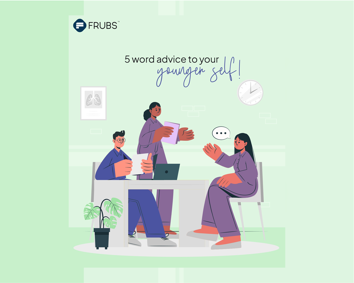
- Digital launch strategy and social media rollout
THE OUTCOME
Frubs transformed from a generic uniform supplier into a premium healthcare lifestyle brand — the first in Pakistan to approach medical apparel as a design challenge rather than a functional commodity.
The brand launched with a clear identity, a strong e-commerce presence, and a visual story that resonated with its audience. Uniforms are no longer just worn. They are experienced.

.jpg)